
Mitel One
Unifying Chat, Telephony & Video for Enterprise
I led UX to merge MiCollab (VoIP + chat) into a single, modular app spanning iOS, Android, Web (PWA) and Desktop—under strict on‑prem & cloud constraints.
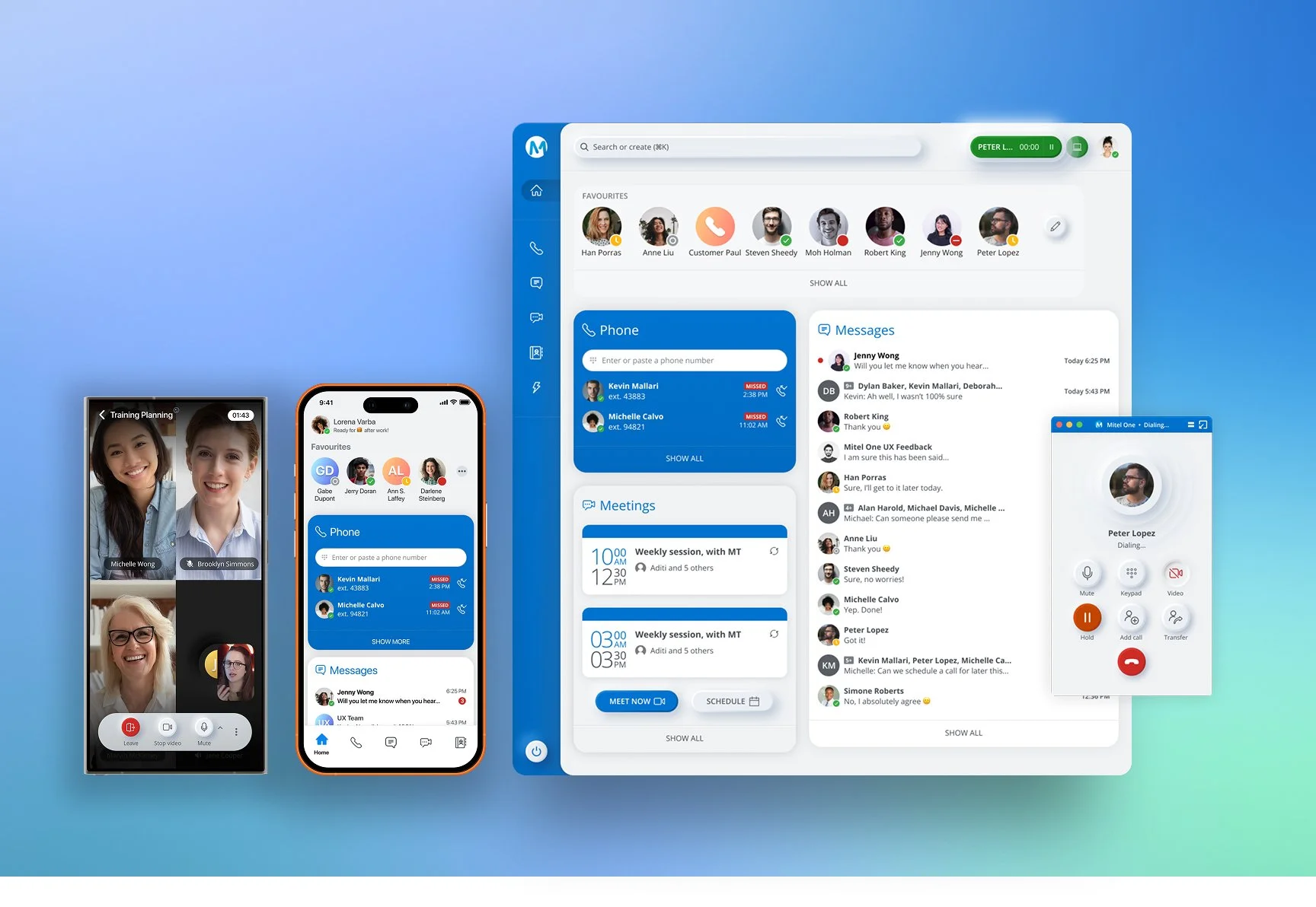
Cross-Platform UX Leadership
Lead UX, I directed the end-to-end design process across iOS, Android, Web (PWA), and Desktop platforms, ensuring a consistent and scalable user experience. I collaborated closely with a cross-functional team of 8 designers, product managers, engineers, and sales stakeholders, aligning business goals with user needs. This work spanned a multi-quarter timeline, where I guided the design vision, established workflows, and delivered solutions that supported both short-term feature rollouts and long-term product growth.
My Role & Ownership
Owned the end-to-end UX experience during the first 8 months
Sole Product Designer at launch
Partnered directly with founders and one PM
Led and mentored 3 junior designers
Defined MVP scope and product roadmap
Designed the UI system and interaction model
Built a scalable component library
Directed key product flows and visual decisions
Context & Challenge
Mitel sold chat, telephony, and video as separate SKUs. Enterprises glued on Slack/Zoom/Skype to fill gaps. The market demanded a unified experience that preserved core telephony, worked for on‑prem and contact center realities, and scaled across devices.
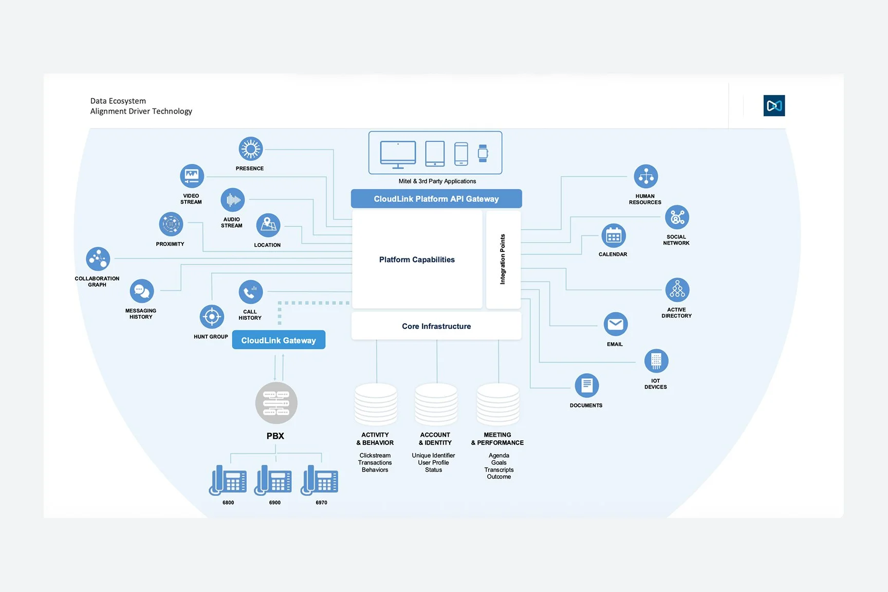
Ecosystem map — on‑prem vs cloud vs contact center
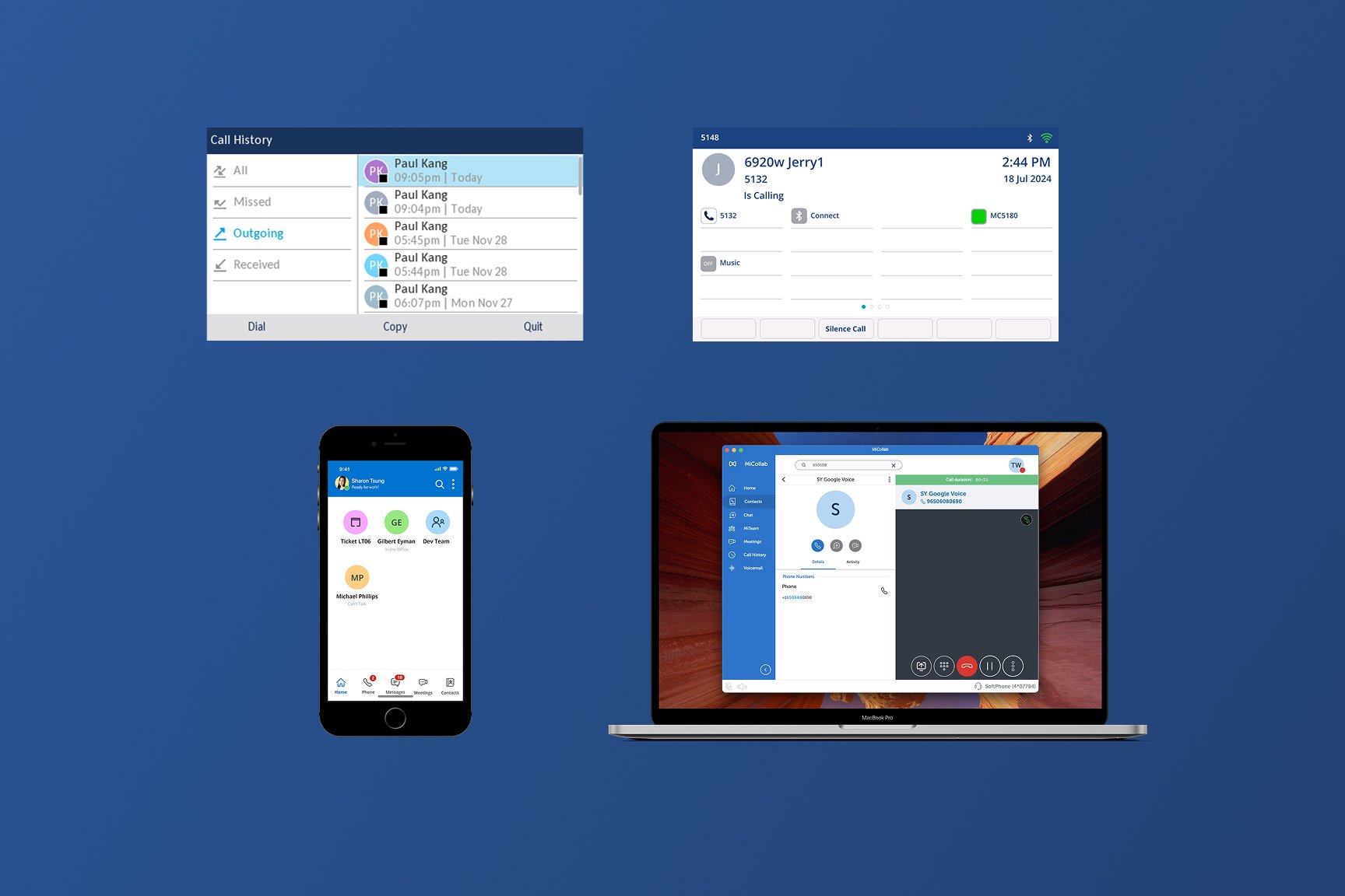
SKU fragmentation — before state
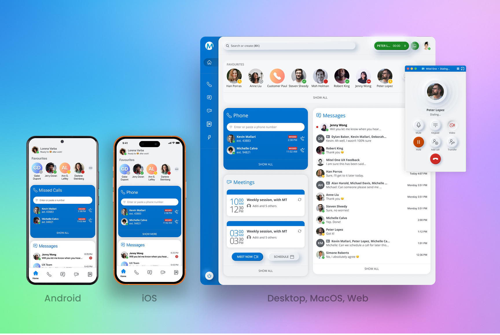
Unified target state — after
Research → Strategy
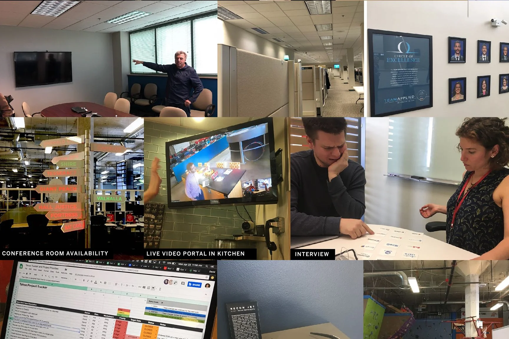
We teamed up with research company Frog to conduct interviews with MiCollab customers, surveys, card sorting, and competitive analysis (Slack flexibility; Zoom one-click join). These insights informed the ‘85% Rule,’ prioritizing flows that served the widest B2B cohort.
Personas (admin, agent, IC)
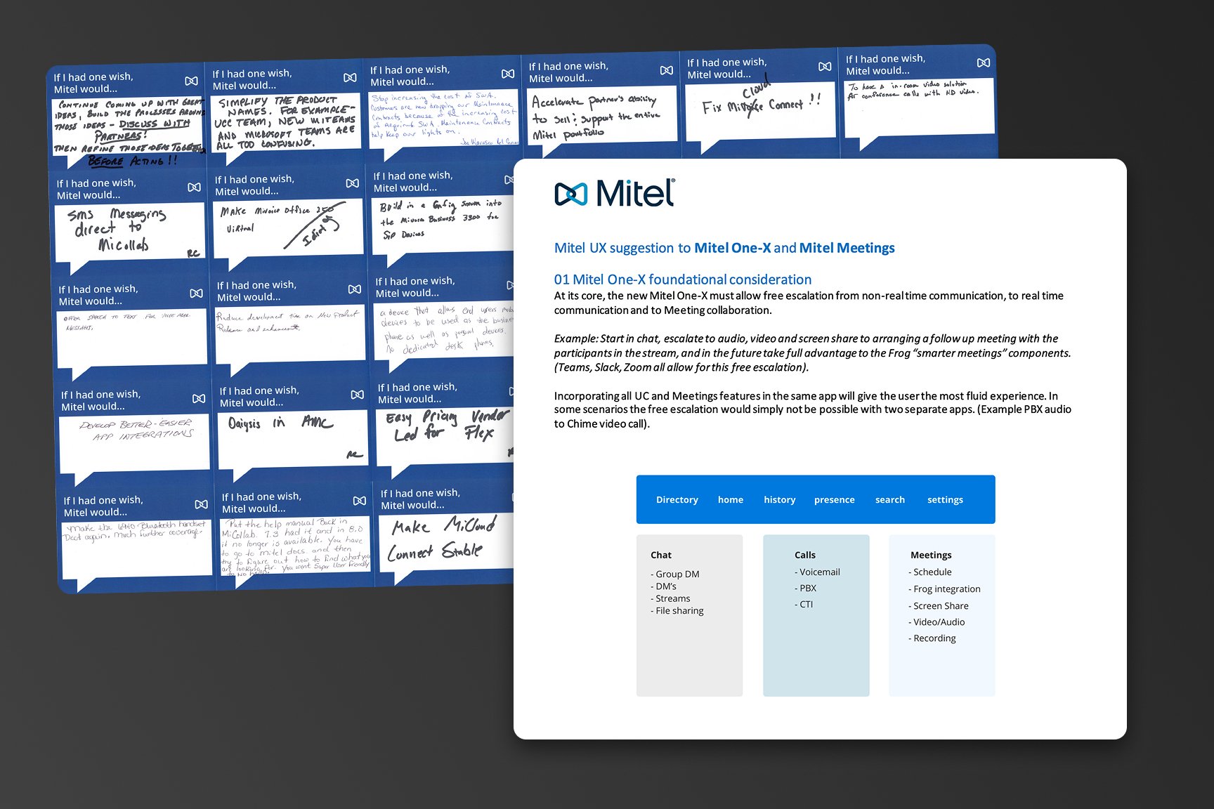
Card sort / feature prioritization
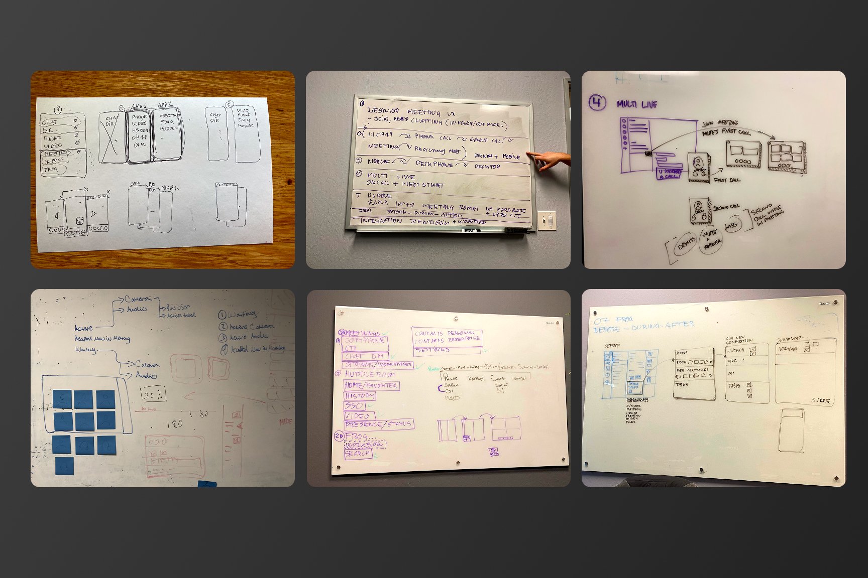
Journey / friction points
System Design Decisions
Modular, widget‑based home
Different orgs are phone‑first vs message‑first. Reorderable widgets let teams tailor the surface while staying in a single product.
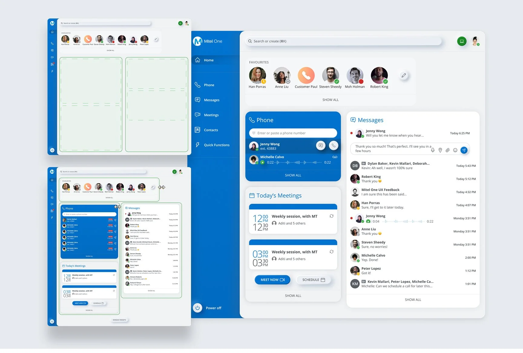
Mobile home with draggable widgets
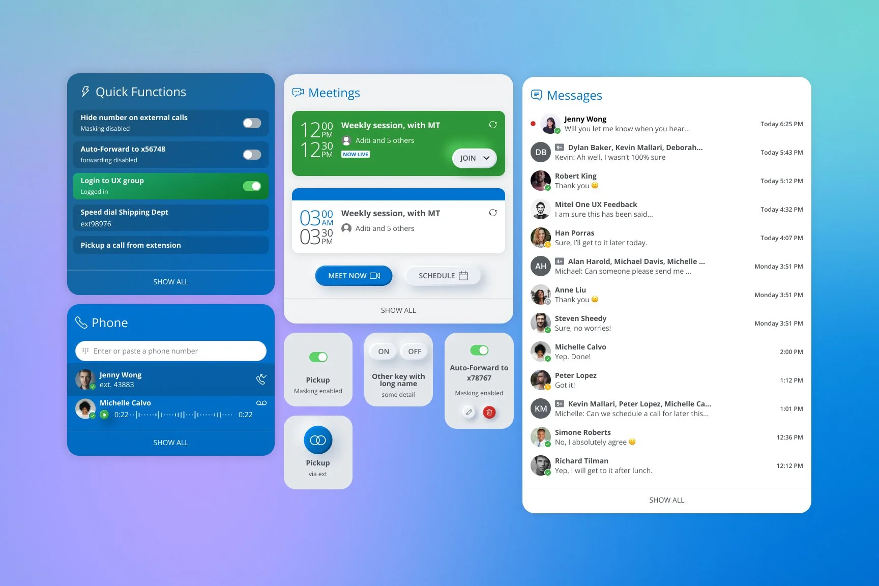
Web layout with prioritized widgets
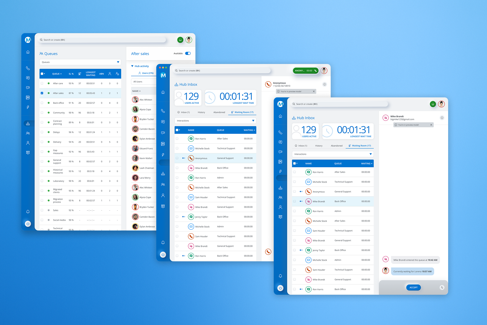
Desktop (high-density)
Escalation as a first‑class pattern
Users jump chat→call→video. Inline actions make escalation immediate without copy‑paste links.
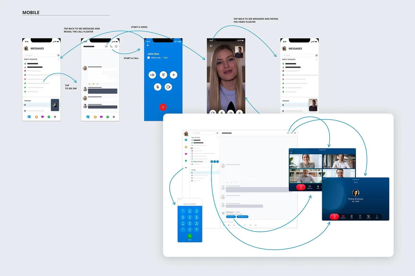
Chat thread with Start Call / Start Video
PWA vs native: pragmatic trade‑offs
Timeline drove PWA. I redesigned notification patterns (call vs meeting vs message) to retain urgency and clarity across OSes.
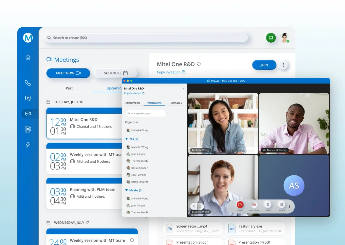
Join Meeting
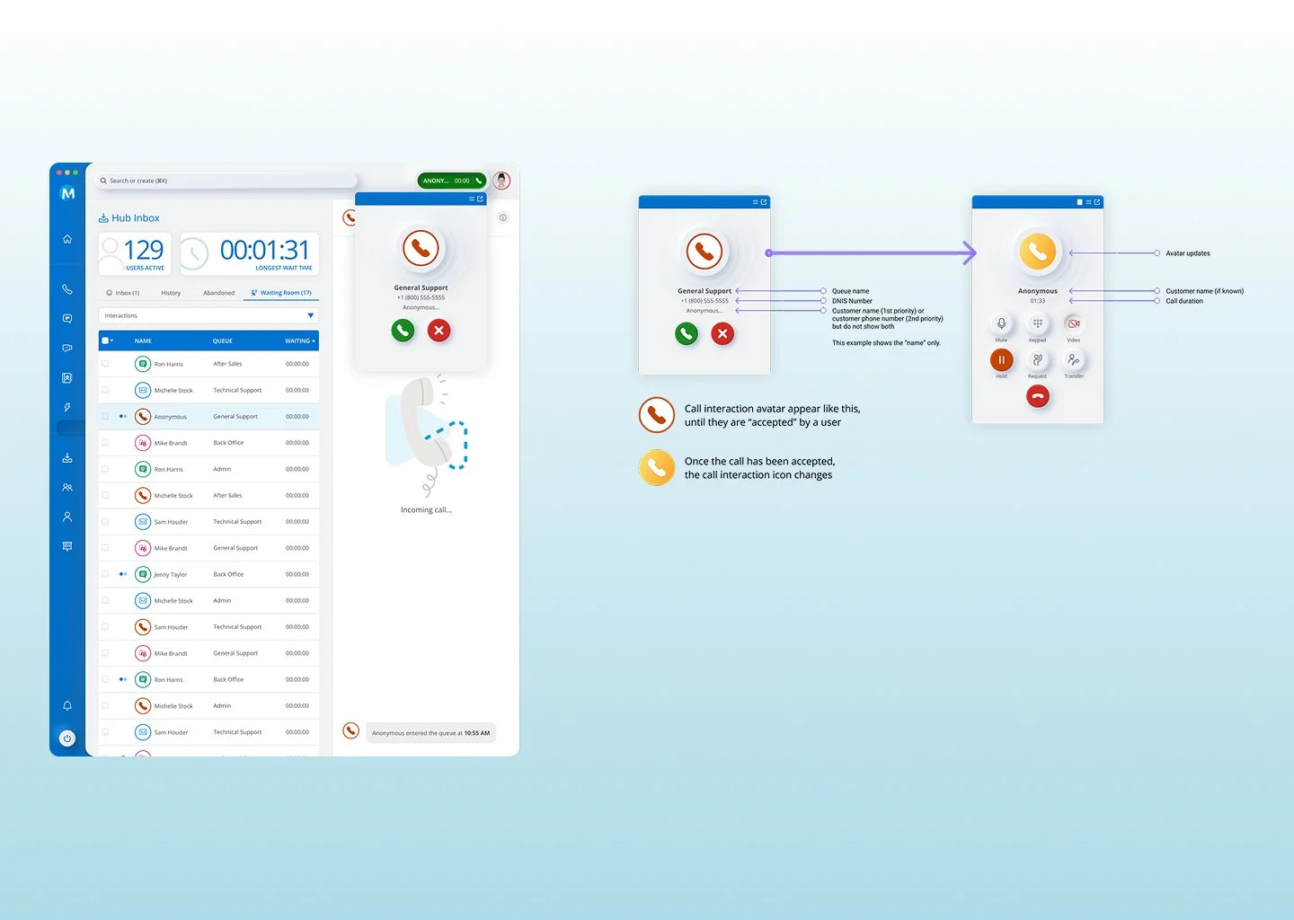
Incoming call toast — Answer / Decline
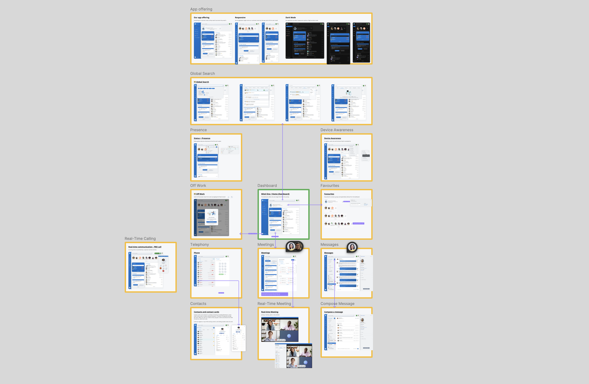
Desktop Interaction
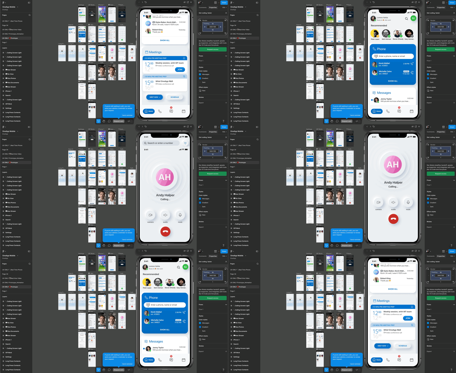
Prototype frames — mobile first
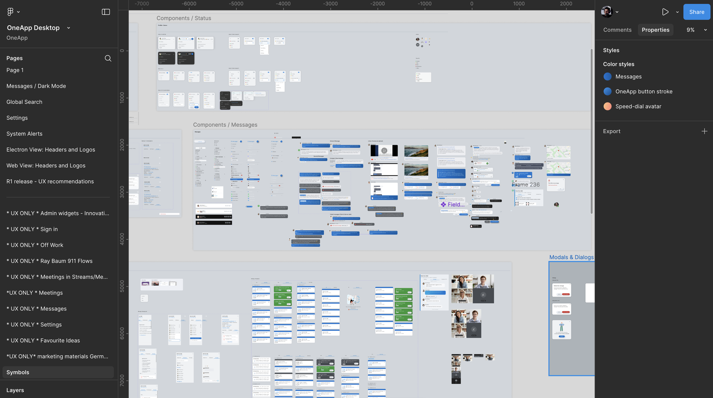
Design Library system and Components
Impact
Drove higher early adoption and strengthened the sales narrative for mixed-need accounts. Improved time-to-join and clarified escalation between modes, while a consistent cross-device experience increased customer confidence during rollout.
What I’d Improve Next
Run accessibility reviews earlier across notification variants, introduce admin templates for default widget layouts by persona (Contact Center, Sales, Exec), and explore a native desktop shell for deeper OS-level call controls as maturity grows.