

Ounda App - Stem Music Player
Ounda App is an iOS stem-based music player that allows musicians to distribute interactive albums directly to fans while retaining control over their masters. I led product design end-to-end, transforming an initially fragmented and inspirational concept into a focused Version 1 by introducing progressive disclosure and prioritizing core user actions. The product launched in beta in 2023, with 87% of users clearly understanding what the product was and how to use it, establishing a scalable foundation for future growth.
The Context
When Ounda began, the idea was exciting but difficult to explain. Musicians were eager to regain control over their music and explore new ways to engage fans. Producers saw creative possibilities in remixing and stem manipulation. Listeners were intrigued by the idea of interacting with music beyond play and pause.
The problem was that everyone understood a different version of the product.
Early conversations generated enthusiasm, but they also expanded the scope. Each discussion introduced new features, new use cases, and new directions. The product could be many things at once, and that flexibility became the biggest risk.
My role was to turn that excitement into clarity and define a Version 1 experience that users could immediately understand and grow with over time.

The Problem
The initial product vision was broad and inspirational, but unclear in practice. Because the app attempted to serve musicians, producers, and listeners simultaneously, early designs exposed too many features too early.
As a result:
Users struggled to identify the product’s core purpose
Investors and collaborators had difficulty understanding the business objective
Feature discussions increased confusion instead of reducing it
The challenge was not usability — it was focus.

My Role & Ownership
I worked as the Product Designer, owning the product from early concept through beta launch.
I was responsible for:
- Leading qualitative user research
- Defining product direction with a project manager and a producer
- Designing wireframes, prototypes, and the full UI system
- Conducting usability testing
- Supporting development with a 6-person engineering team
My primary responsibility was to clarify the product vision, reduce scope risk, and design a coherent Version 1 experience.
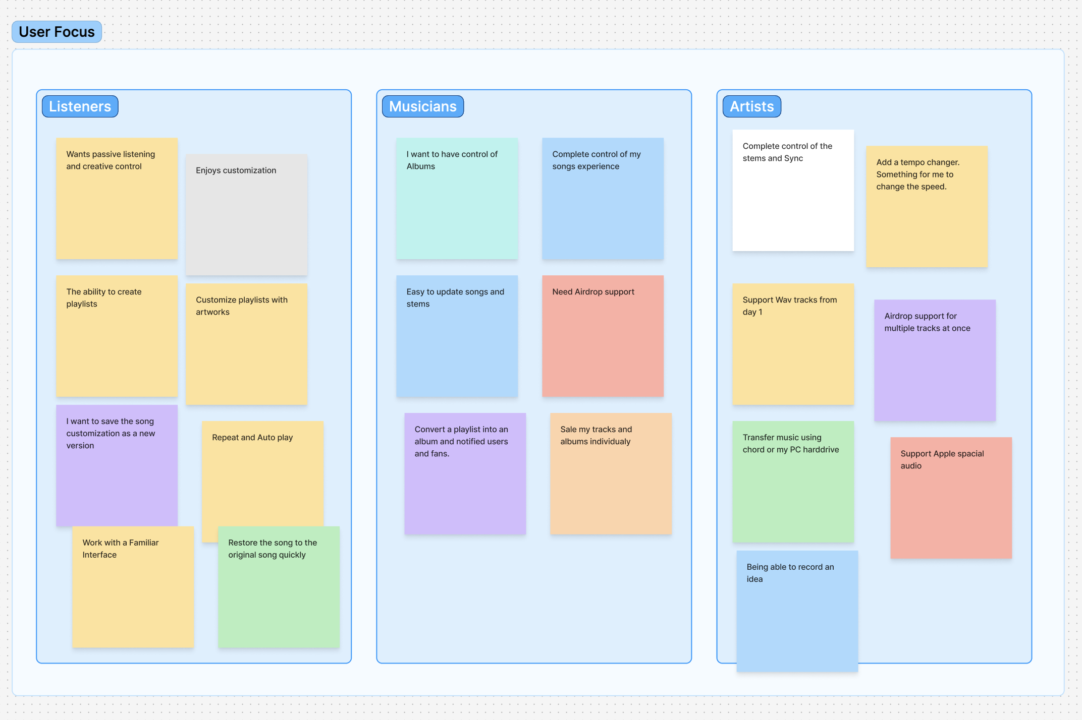
Research & Key Insight
I conducted qualitative research with:
2–3 musicians
2 music producers
3 listeners
Participants were asked about their current music platforms, what worked, what didn’t, and what they wished they could do differently.
When early concepts were shown, a clear pattern emerged:
Each user group understood a different part of the product
The overall ecosystem felt exciting but overwhelming
Feature conversations quickly expanded beyond a usable entry point
Key insight:
The biggest risk was not feature usability, but cognitive overload caused by exposing too much too soon.
Design Strategy
To reduce risk for Version 1, I introduced progressive disclosure as the core design strategy.
Instead of launching with all potential capabilities, I focused on:
Core actions that defined the experience
Reusable interaction patterns
A mental model that could support future expansion without rework
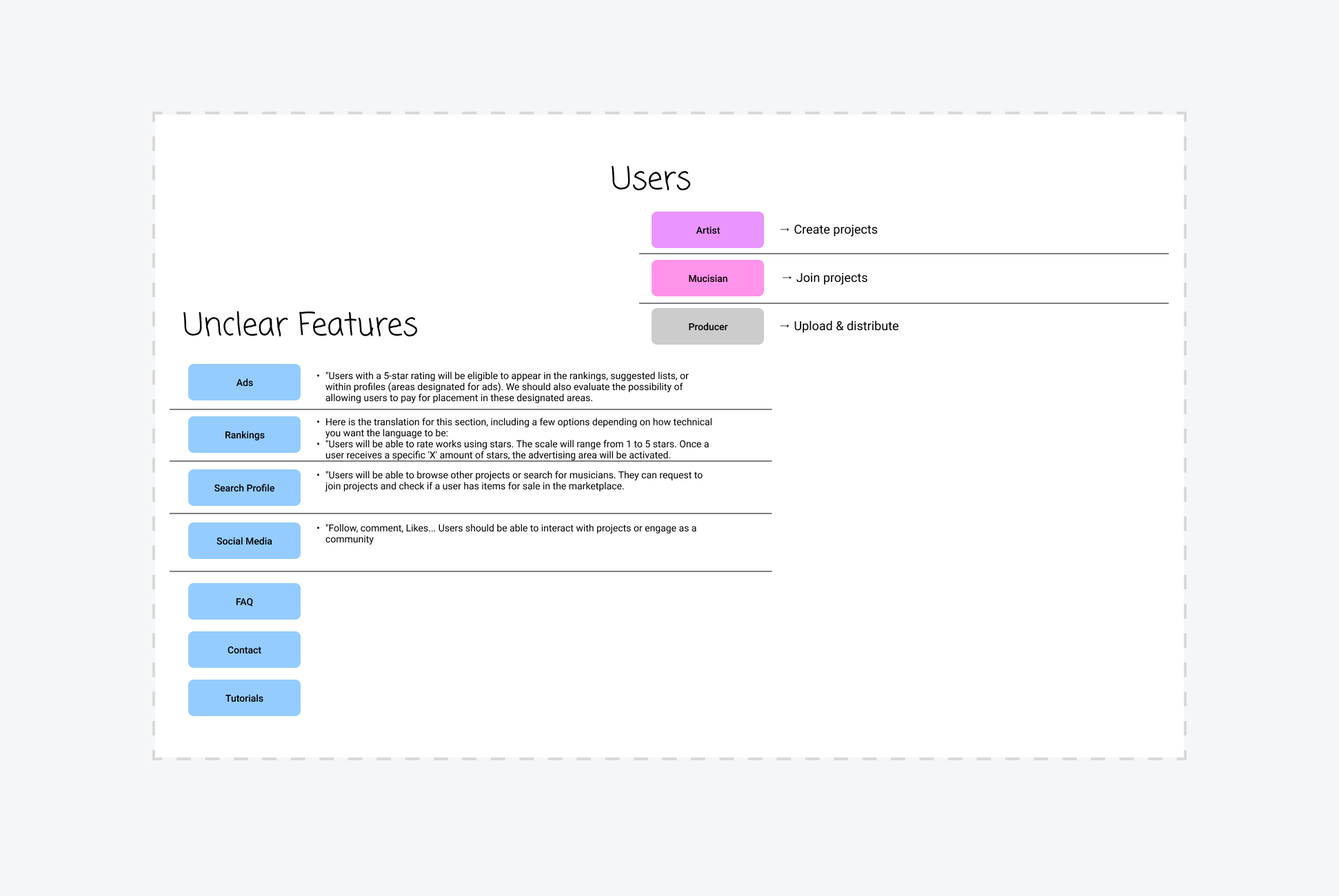
Features were prioritized by user type:
Listeners
Listen to music
Customize individual sounds
Create playlists
Musicians
Upload audio files
Customize albums
Control stems
Producers
Accurate audio synchronization
WAV and MP3 support
Third-party file imports
This allowed each user group to succeed without being exposed to unnecessary complexity.
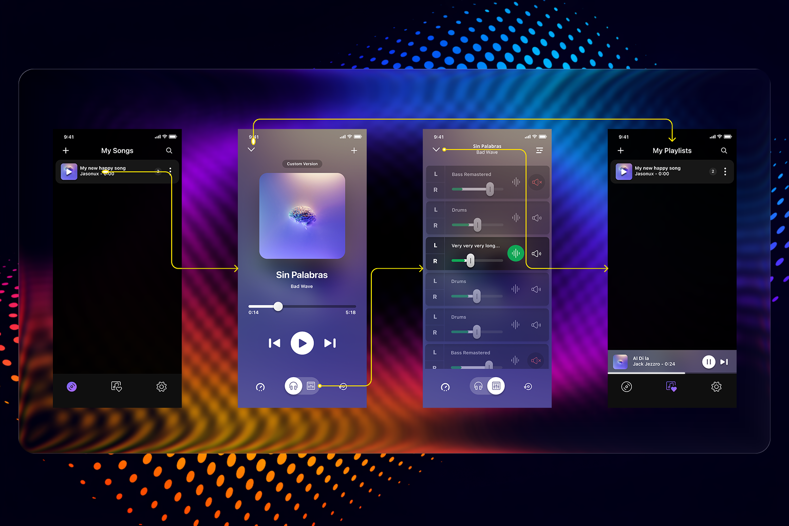
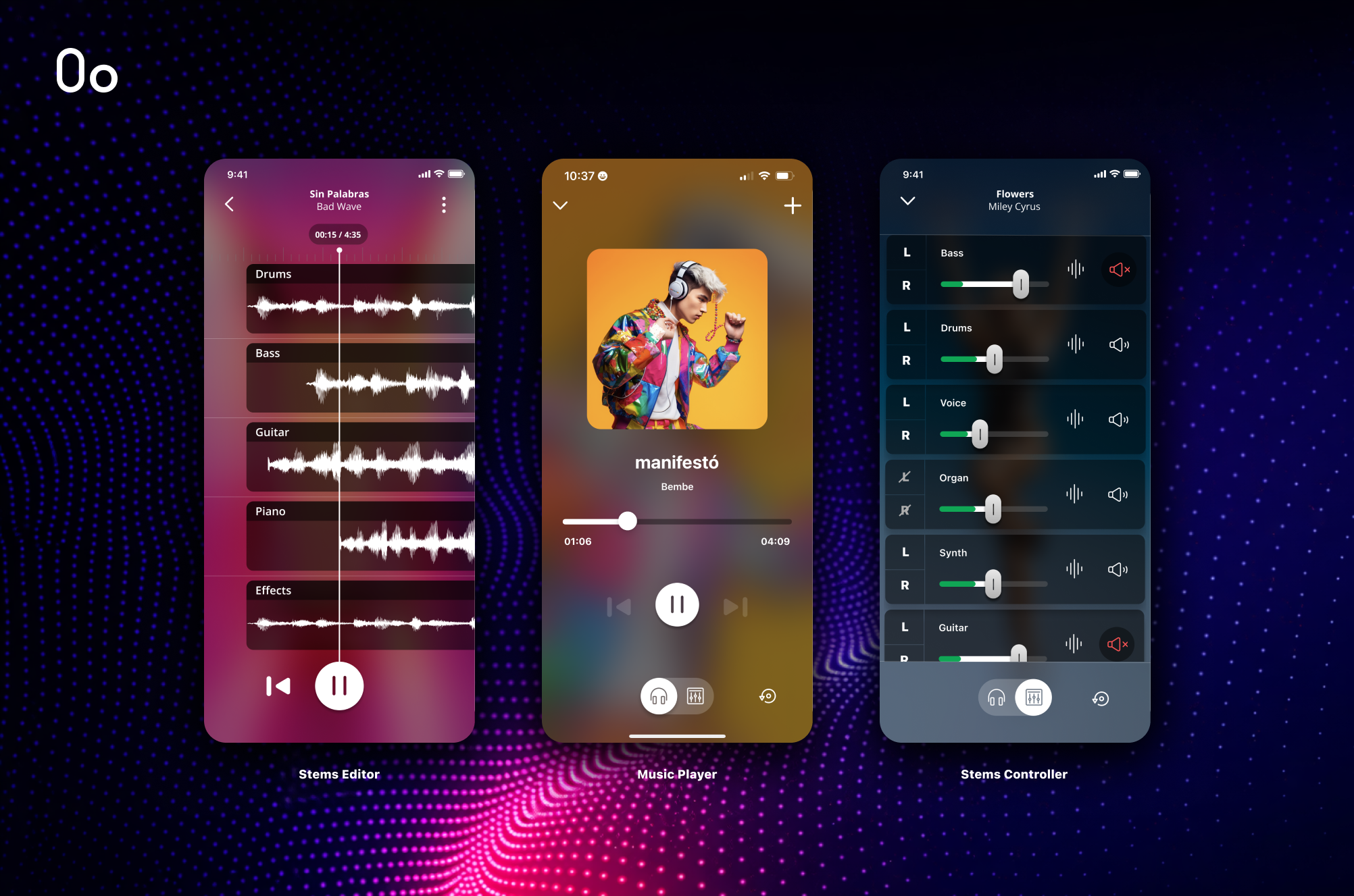
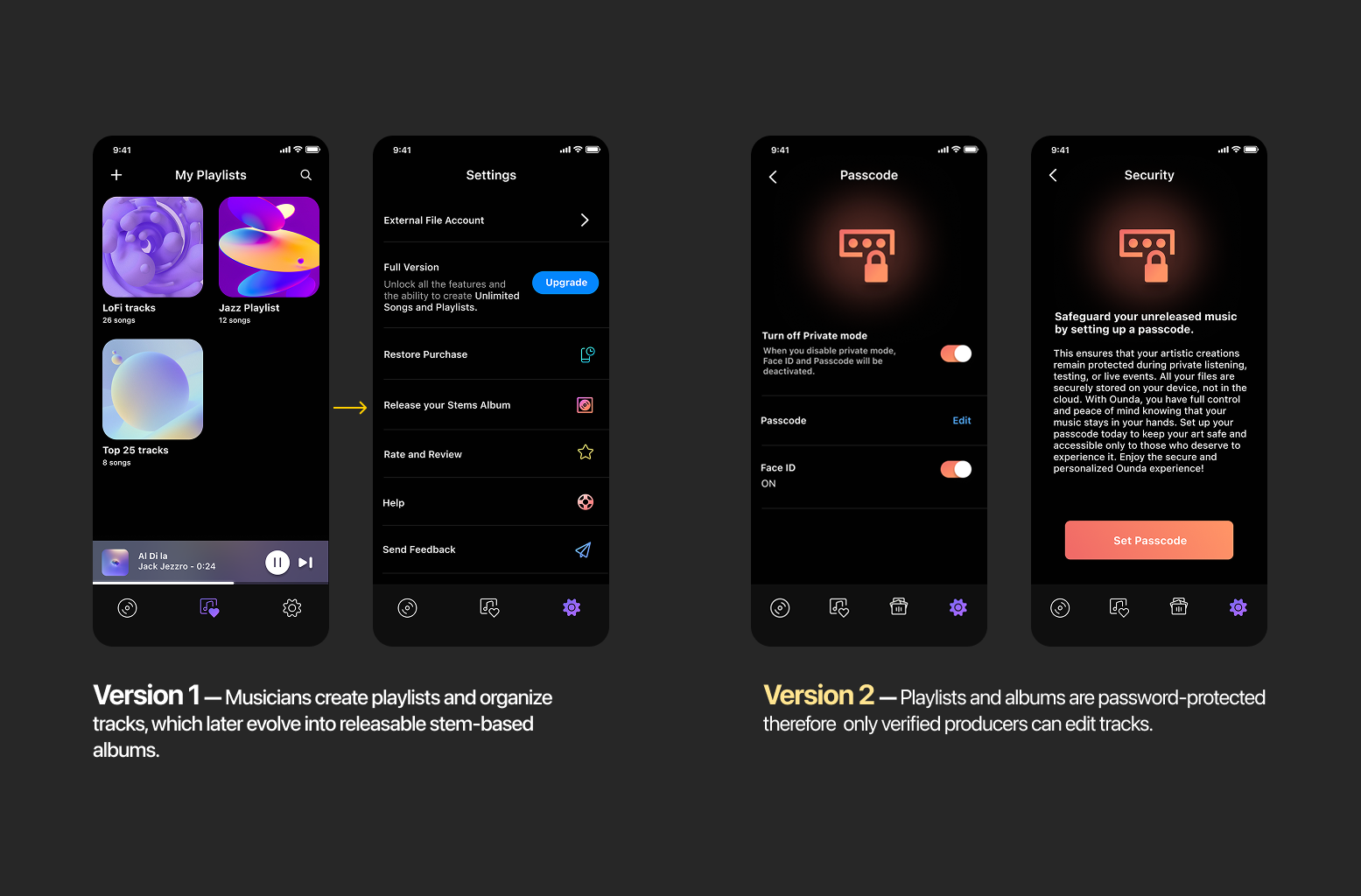
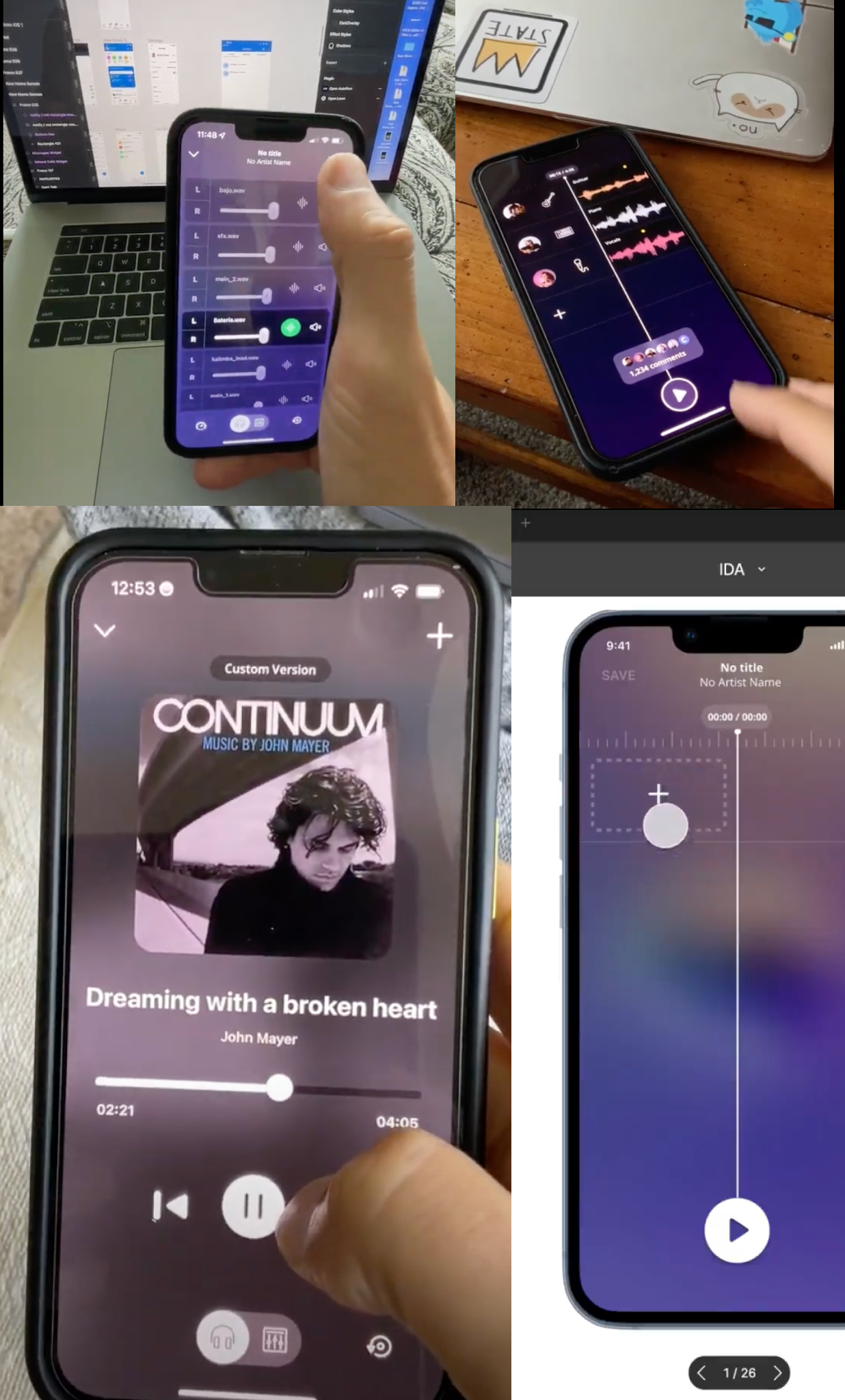
Version 1 Experience
Version 1 was intentionally minimal.
The experience focused on:
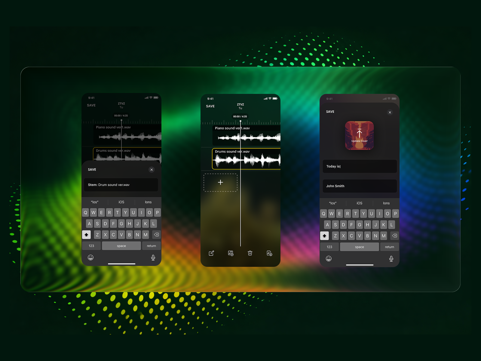
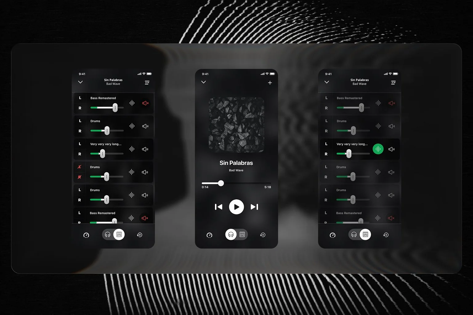
Uploading music
Editing stems
Controlling sound levels
Creating albums and playlists
Applying brand visuals
The interface was designed to teach users through repetition. Actions were intentionally reusable so that learning one workflow helped users understand others. This created a foundation where future features could feel additive rather than overwhelming.
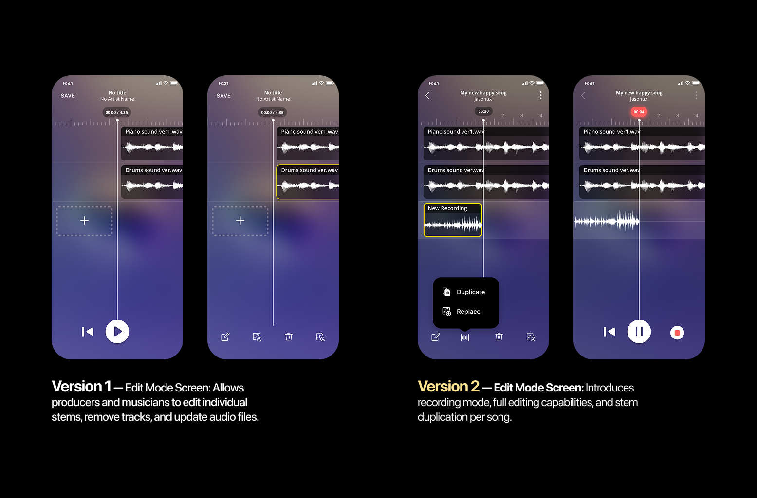
Validation & Testing
The experience was validated through:
Early questionnaires
Low-fidelity wireframes
High-fidelity interactive prototypes
Beta testing with real users
Testing focused on:
First-time understanding
Task completion
Points of confusion
Moments of delight
Outcome
87% of beta users clearly understood what the product was and how to use it
The app launched in beta in 2023
A subset of users adopted the app for unexpected use cases, such as private listening groups and song testing
Some users requested more features, reinforcing long-term potential while validating the decision to limit Version 1 scope
Key Learnings
Broad creative visions increase excitement but also expectation risk
Progressive disclosure is essential for complex creative tools
Early “wow” moments must be balanced with clear boundaries
Large audio files introduce technical constraints that must be considered early, such as storage and cloud dependency
Final Takeaway
This project reinforced the importance of clarity, restraint, and sequencing in product design. By narrowing focus and teaching users through core actions, we delivered a product that was understandable at launch and flexible enough to evolve with its users.