Corvisa One
SaaS, iOS, Android, MacOS, Windows, Web
To comply with my non-disclosure agreement, I have omitted and obfuscated confidential information in this case study. The information in this case study is my own and does not necessarily reflect the views of Corvisa.
Corvisa One Application
Corvisa one is a business phone system which has complete integration in the cloud. With this application users can create and manage their entire business phone system or call centers with just a few buttons. The system delivers a flexible and seamless experience across every OS platform and a very high-level administration web application. The application is designed to scale on demand, with a very simple UI and autonomous processing.
My Role
At Corvisa I led the visual, interactive, and user experience from end to end across multiple platforms such as iOS, Android, Windows, Mac, and Web. I designed the wireframe, prototype, and each element of the system to create a similar experience across all operative systems. I conducted research and testing experiments with various tools and high fidelity prototypes. I worked with product managers, business development, sales team, and engineers to deliver the best product experience and meet business goals.
- Wireframe and Prototype
- Visual Design
- Interactive Design
- UX Design
- Research
- Information architecture
First Idea and Prototype
The challenge of designing this product was to get a deep understanding of what customers are looking for in the telecommunication area, and how we can serve future customers with better ideas and functionalities. To gather the idea and prototype, I had to study the product and meet with customer support and business development to understand daily challenges. The sales team was a great input because I can also see, and have an idea of, future development, the amount of complexity on the product, and the challenge of customer needs.
I started with very rough details about defining agent need compared to a supervisor or admin. With that in mind, the first prototype of the web interface was designed to answer questions such as what a supervisor user is, and what their tasks entail.
Since Corvisa One is built entirely in Corvisa's platform summit, I had to meet with platform engineers, revise functions, and review wireframes for specific details.
I jumped into iOS platform and Mac, since booth development environments share very similar experiences and I can analyze and learn from both platforms simultaneously when prototyping.
On Windows I ran a study to determine the most common Windows version used, and to also be realistic about the situation. For example, the large majority of users ran Windows 7 and Vista at the time, based on the hardware they had available.
Android - After I've learnt from all the other platforms and tested with multiple devices, bringing the experience to Android in a very familiar way was a little simpler. The difference on this platform was experimenting with material design and the latest Android OS.
The Problem
Bringing all this experience together in a similar way and identifying users was not easy. It took me a significant amount of interviews, competitor analysis, and research to create various personas and situations. We had less than five months until we would launch a beta version on Mac, Windows, and web without losing momentum on the rest of the platforms.
The architecture is designed to be scalable, which creates a lot of fragmentation between platforms. The work statement by platform is around 20 to 45 features, and most of these had no label or iconography. To avoid friction in the product, I decided to first tackle the visual language and iconography.
Visual language and iconography
To create a visual language in which users feel welcome and could grasp easily, I had to meet again with the sales and marketing team. I also worked with the educational team to re-word old language and bring new labels to define the iconography.
With that verbiage placed, I designed and worked closely with graphic designers to convert languages in icons and use familiar shapes within the industry. This was not only to create a new iconography for the system, but also for the company itself.
Personas
When I started to identify personas I create three types of use cases for our application. I discovered the difference between the stakeholder’s request and the agents in the front line using our products every day. To create a customizable product for every business, this process had to be repeated multiple times, and sometimes each company had different personas.
Supervisor
- 24/7 Call data
- Total control and transparency
- Mobile dashboard
- Monitor agents anytime, anywhere
- Scalability without development
- Queues flexibility
Stakeholders
- Agile development
- Customized applications
- Control of the communication
- Low cost
- Efficiency and support
- Scalability
Agents
- Communication at anytime
- Windows and Mac platforms
- Call’s Overflow Control
- Understand the system out of the box
Wireframes and Ideas
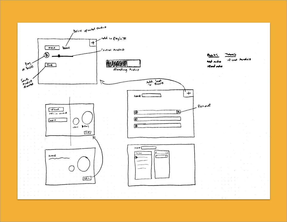
I designed wireframes and prototypes of multiple versions on every platform, and I very quickly came to understand one problem with the web application. The web application needed to have a customized experience based on the company and the type of license purchased, and also understanding that behavior changes the experience and the design.
This gave me a clever idea!
I teamed up with the front end development team and I thought of the idea of designing based modules using ember JS, so that those modules could be reused for different experiences and added to the front end.
iOS - Native controllers and visual language. Most iPhone users recognize native controllers and they are familiar with patterns.
Android - Material design and native controllers. Android users typically don’t use iOS or don’t understand iOS; they choose the Android experience, so I have to deliver that idea to Android users.
Mac and Windows
The engineers used a cross platform called QT, where they can develop only once and push to production for both platforms. With this idea, I had the opportunity to design a seamless application for both operating systems, and it was very easy to understand.
Beta Testing
Corvisa launched the first version of Corvisa One internally, and we tested with over 300 users. While 80% of users loved the new design and usability, I found some very important issues in every platform.
“iOS Quick Transfer”
On iOS version 1.0, users sometimes found poor Wi-Fi signal or LTE. The call quality also had issues in which it could potentially drop the call. I had the task to design a solution where we could transfer the call from the Corvisa One app to the native phone application.
“ I Need Notifications ”
When users hide the software and they receive a call, the application would show on the screen and could interrupt other work. We proposed to create a toast notification on the side, where users can see information about the call. My final design was a simple notification where you can see the necessary information about the call, whilst also providing users the ability to accept or ignore the call.
“ Small Screens ”
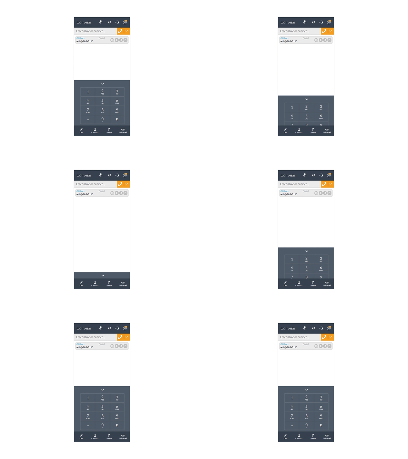
The application was vertical, it wasn’t resizable, and most users found issues on Macs with the doc displaying at the bottom, especially users with 12” MacBooks.
Our software was very easy, since we had Cloud syncing for contacts, history, and CRM integration, and therefore users had no need to keep the keypad displayed on the screen at all times. When the problem with the vertical came up I decided to prototype an idea in which the keypad can be hidden and the window can be resized by the user; even with the keypad in place you can still have a good amount space.
Final product
The final product was pretty impressive. I took a very complicated system and turn it into a simple UI with great usability. Not only is it simple to use, it can also be customized to different businesses, without losing the essence of the application.
Admin CRM
- System main page
- Enter user
- Voicemail
- CTI adapter
- Route points
Softphone
- Phone call
- Chat
- Voicemail
- Multiple calls
iOS
- Call screen
- Dashboard
- Chat
- Voicemail
Android
- Call Screen
- Contacts
- Profile
- Voicemail
Validation
Corvisa One was launched on time and we continue to work on iterations. The system had a very positive impact on current customers and provided new opportunities for potential customers. I met all the business’ objectives and I discovered in the process new ideas and how we can implement them.
The next step on this journey is to bring Corvisa One to Salesforce, expand more features, and simplify the experience.


